
Identity
Project: Marketing Rebrand
Material: Various Marketing Materials
Client: Edgeworth Economics
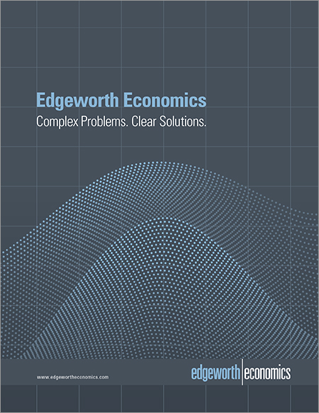
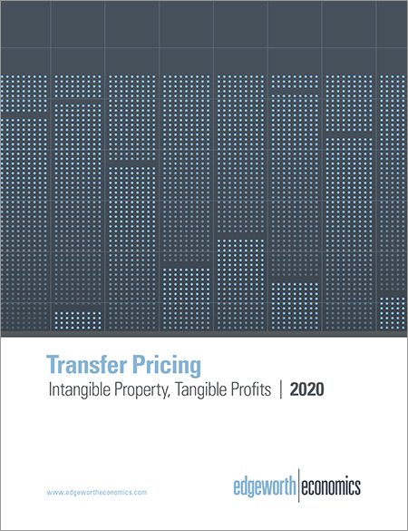
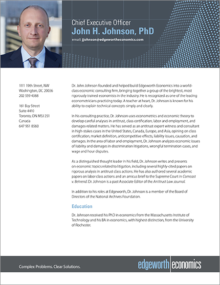
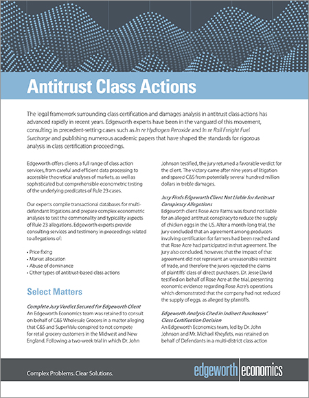
Throughout 2019 I worked with the branding firm Pelorus Partners to complete a corporate rebrand of Edgeworth Economics. I was the creative director, and main designer of the rebrand. The first step in the project was for Pelorus Partners to conduct market research of Edgeworth’s industry sector – economic consulting. The findings were that Edgeworth generally had a strong reputation, but so did most of their competitors. Edgeworth, like many of the firms in the sector, did not have a strong visual brand. A new look was needed to help differentiate Edgeworth, and better communicate the company’s attributes.
Several design options for the rebrand were created, refined, and presented to the company’s rebrand committee. The look that was selected conveys Edgeworth’s high-tech, cutting-edge approach (using a recognizable set of graphics which represent their objective, state-of-the-art, analysis of data). While blue is commonly used in the industry, the rebrand committee wished to keep a connection with their previous brand (which used blue and a medium gray), so the redesign uses an unusual shade of blue that subtly suggests Edgeworth is different – as robust as any of its competitors, but it is a firm that approaches problems using innovative methods.
QUESTIONS OR COMMENTS? Email us.
© Arthur Schening 2011. All rights reserved.